ClientAuxilium ( business owner: Marin Skoklev)ServicesIdentity designYear2024
About Project
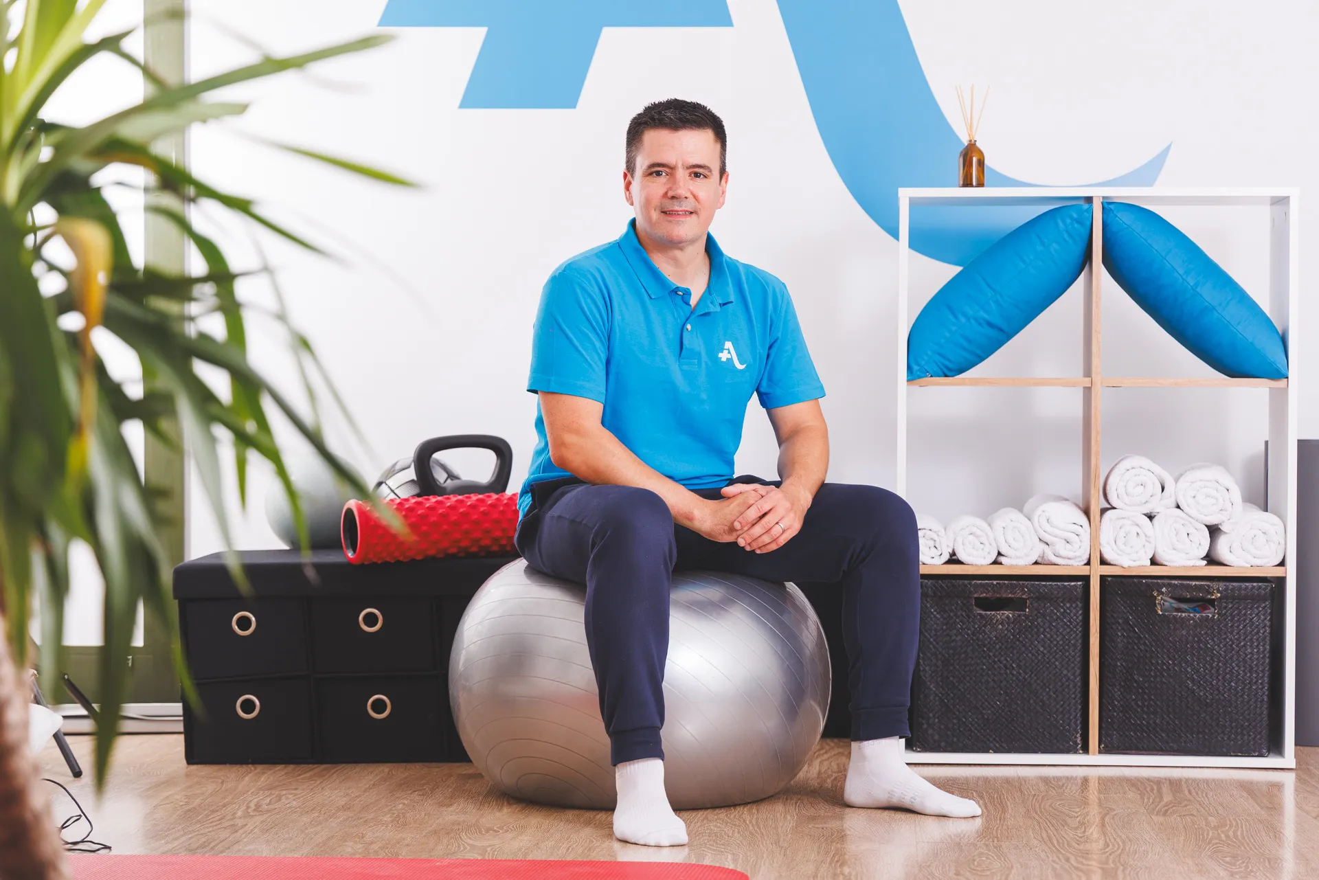
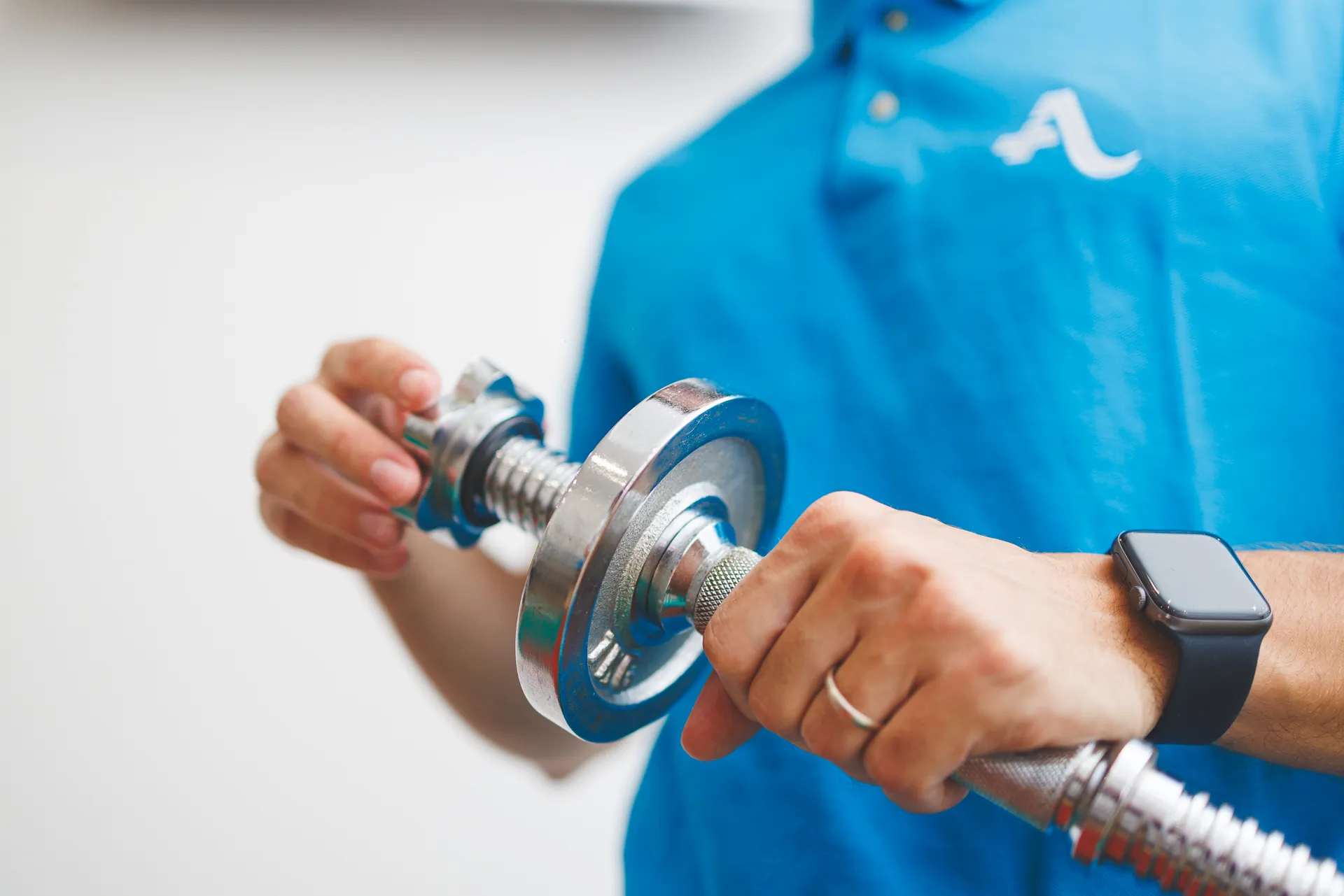
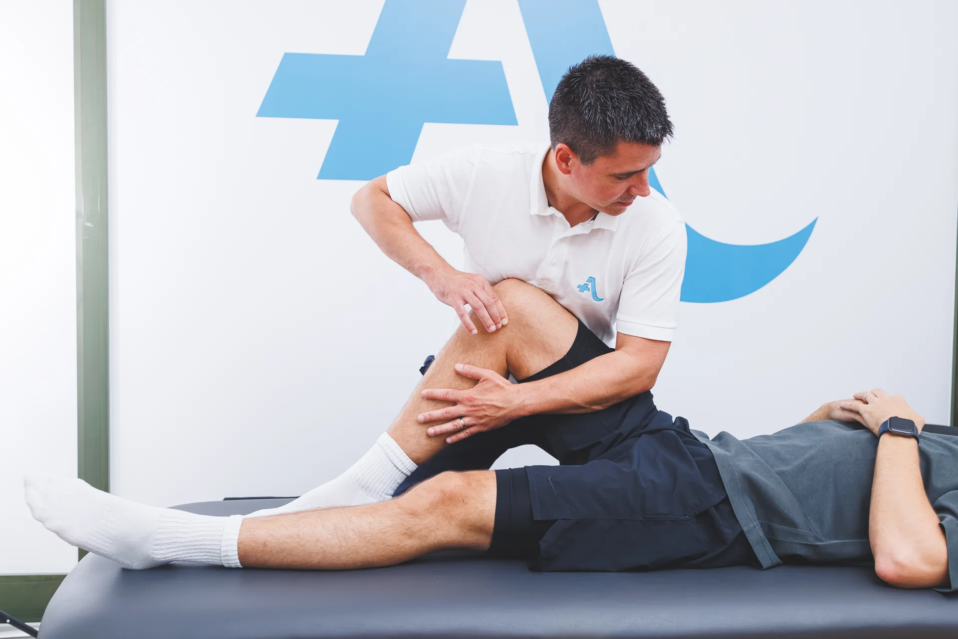
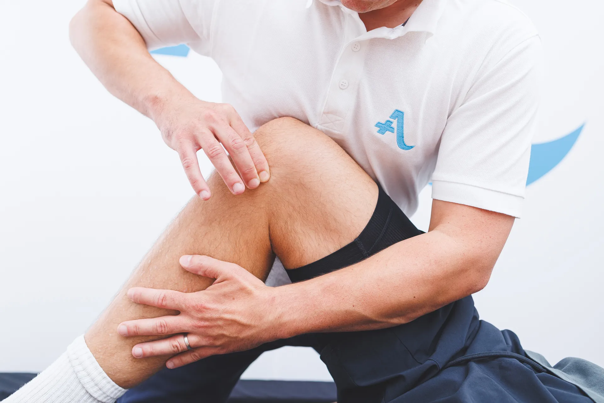
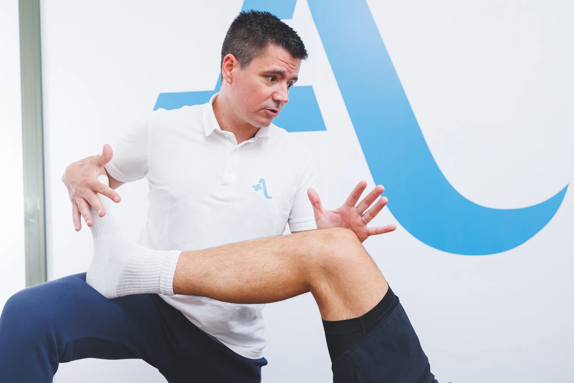
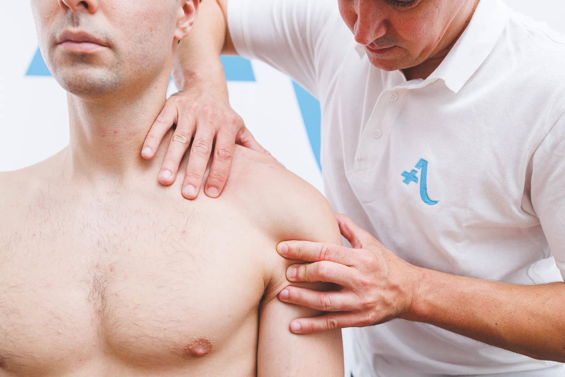
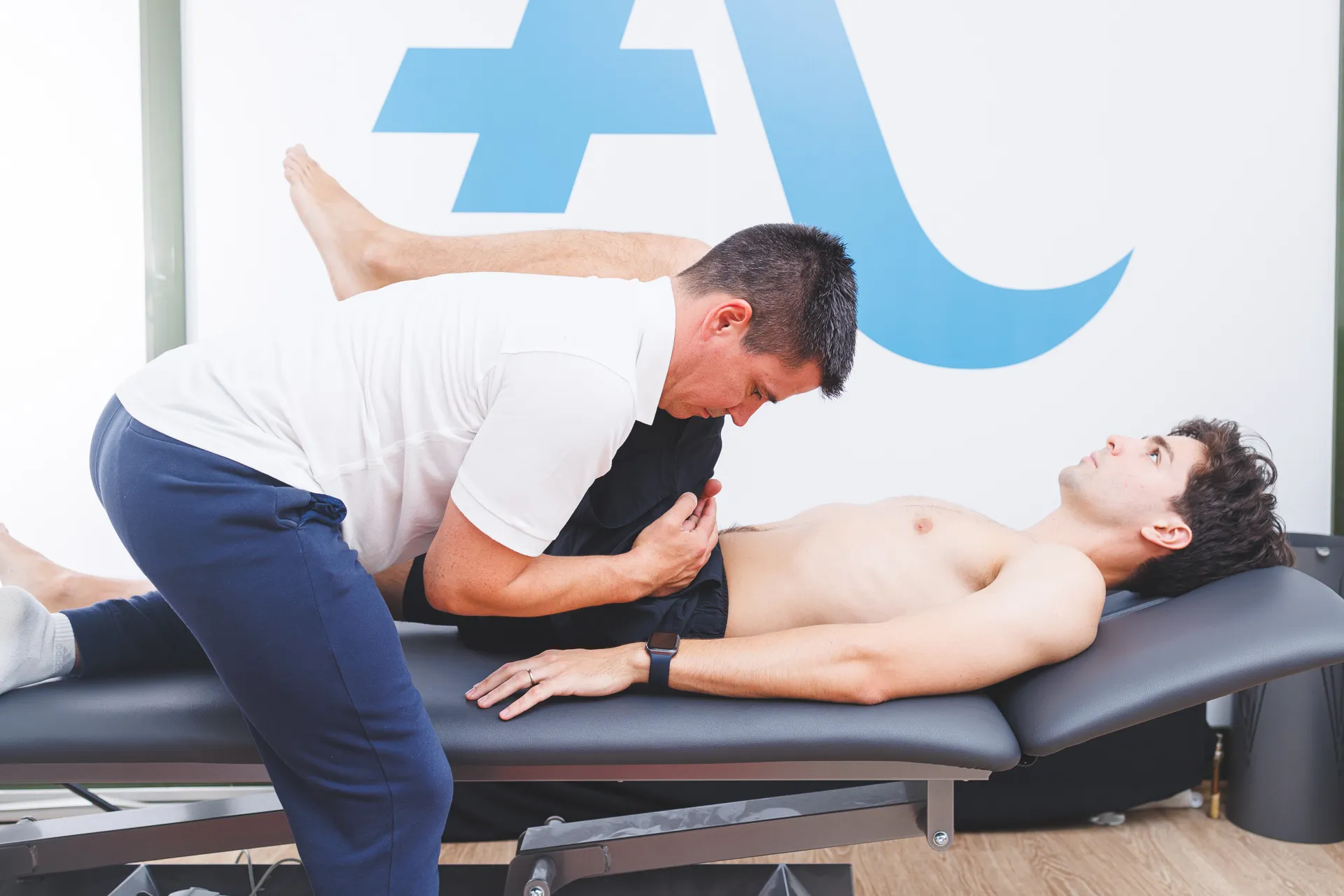
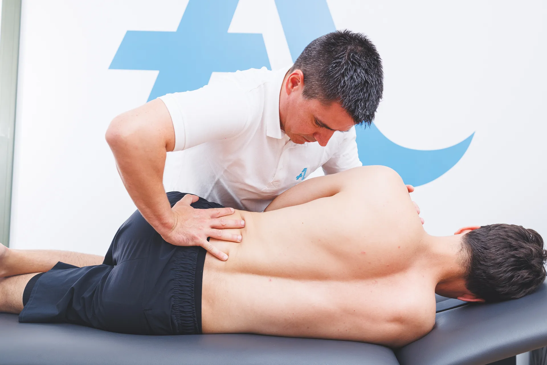
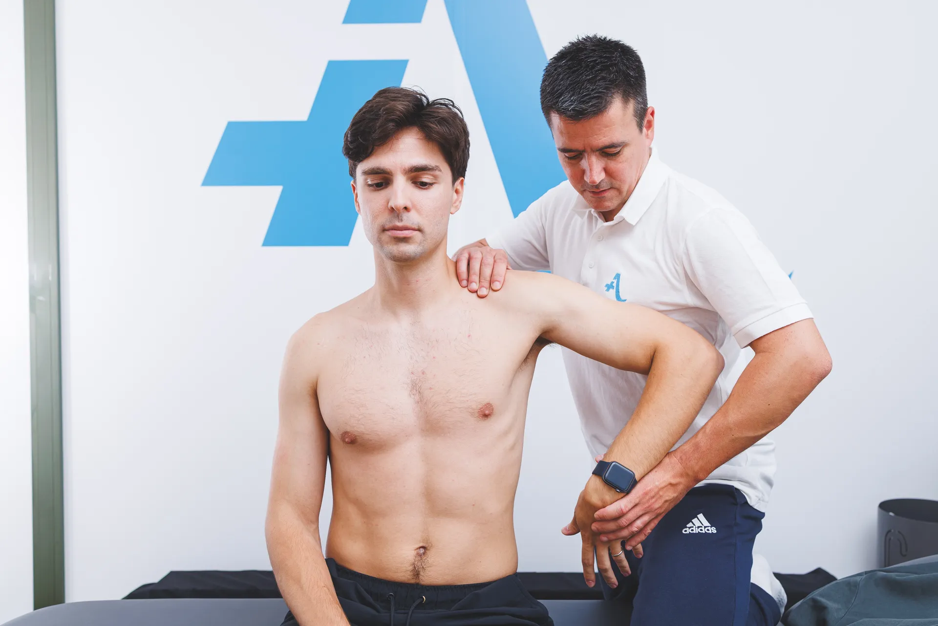
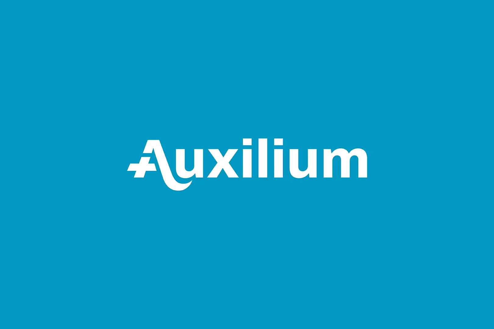
Centered on the concept of restorative care, the identity for Auxilium—Latin for help—translates the clinic’s personalized approach into a precise visual language. The core mark utilizes a custom construction of the letter ‘A,’ integrating a plus symbol as a functional anchor referencing universal medical signage, while a subtle curved element symbolizes a reached out hand, reinforcing the idea of care and support. Through stable typography and a deliberate blue-centric palette, communicating a sense of clinical reliability and professional reassurance. The result is a clean, modular identity built on the pillars of clarity, trust, and functionality.